The story behind the design: Jonne Verheij on designing for wonder

Good design is more than aesthetics; it's empathy. How do you guide a visitor without taking away the magic of discovery? In our first Team Spotlight, we delve into the world of Jonne Verheij, the graphic designer who builds the visual bridges between our installations and the audience.
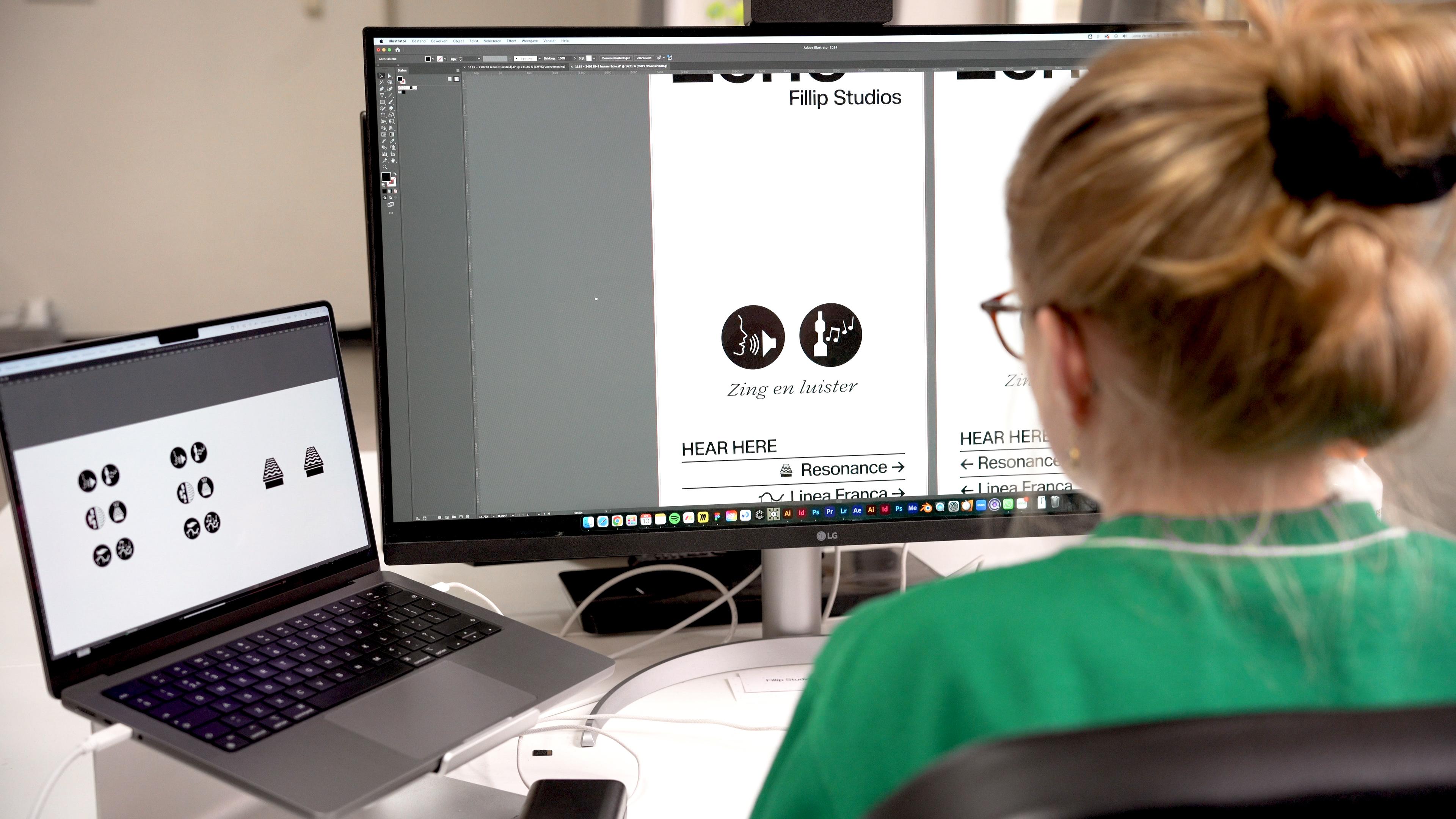
"I'm a graphic designer at Fillip Studios," Jonne introduces herself. "This is my workspace where I make all the graphic designs or edit the photography or the videos for everything that we make." However, her role is much more than creating beautiful images; it's a crucial layer that defines the total experience. The central question in her work is therefore fundamental to the studio: how do you translate the soul of an interactive artwork into a clear, inviting guide?

The Core: To serve without dominating
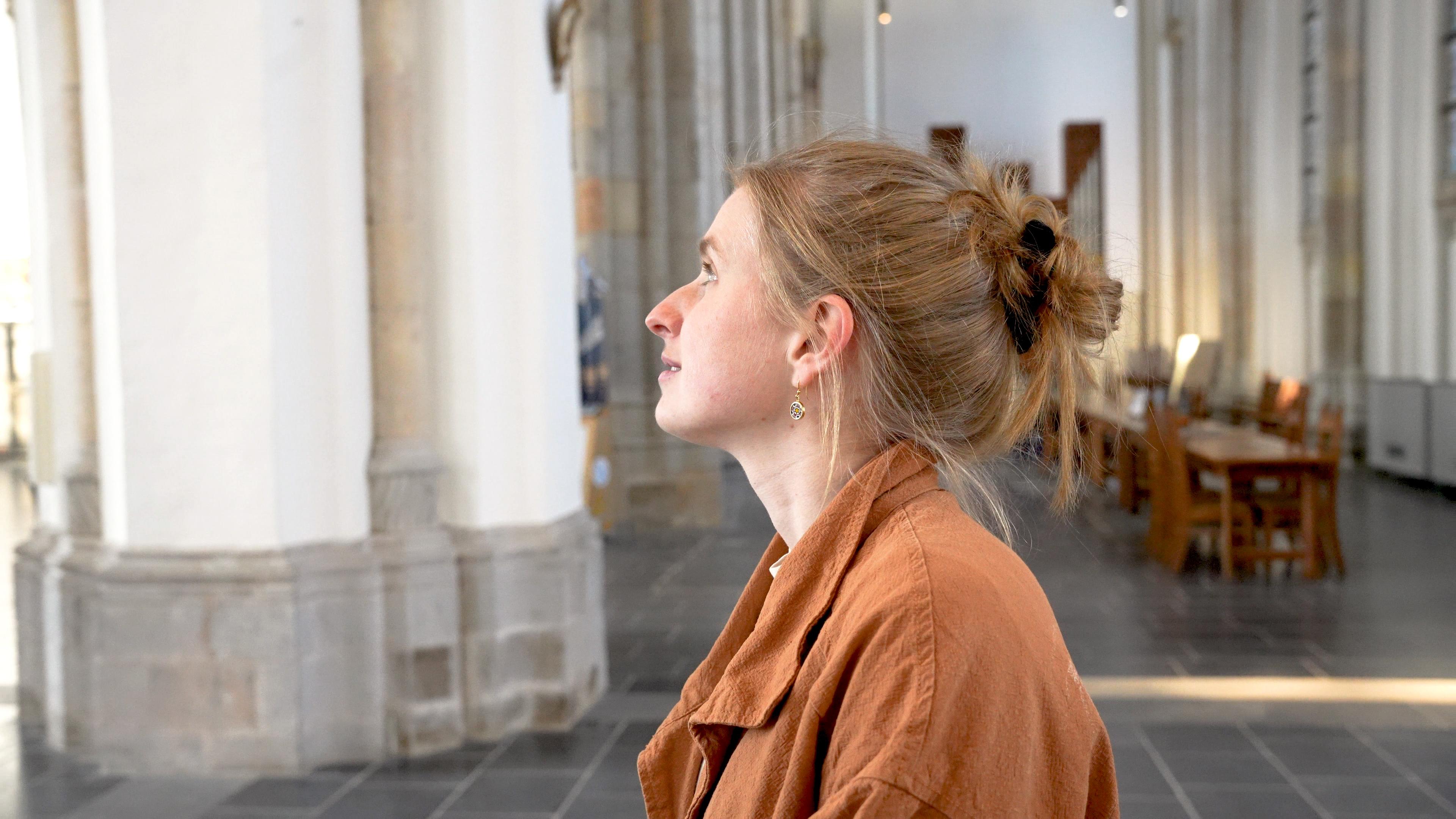
For Jonne, the most important part of her work "is to really enhance these artworks, designs and experiences that we make." This principle became the core of the challenge for the recent solo exhibition 'Hear Here' in the Eusebius Church in Arnhem. The goal of the exhibition was to connect, inspire, and convey the power of music and interaction. "And the graphic design layer is there to help accomplish those goals," Jonne explains. This requires a delicate balance. The design must inform and invite the visitor, but never distract from the artworks themselves.
The process: The search for the New Optimum
Jonne's work for 'Hear Here' is a prime example of the core value of 'Accessibility' in practice. The design process was aiming for a dialogue between the installation and the visitor. From the initial sketches for the icons to the final wayfinding in the monumental church, everything was aimed at an intuitive experience.
This is where the philosophy of 'the new optimum' is put into practice. It is the refusal to choose between function and wonder; it is about achieving both. Jonne's wayfinding guides visitors with clarity, yet preserves the magic of discovery. "So the graphic design layer of the exhibition is really there to make sure that visitors are informed enough to know what they have to do throughout the interaction of the exhibition. But of course, it's also there to really tell the story of the exhibition," says Jonne. This is done through banners that display titles and the expected interaction, but also through a multi-layered flyer.

The impact: From wonder to value
A well-thought-out graphic layer is not an extra; it is essential for the user experience and the final impact. Jonne's work ensured that visitors understood the interactions more intuitively, aiming for an increased duration of their stay and the depth of the experience.
The flyer is a perfect example of this. It not only provides all the necessary information but also contains a digital layer accessible via a QR code. "So when you scan the QR code and point your device at the pictures in the flyer, videos of the artworks will start playing," Jonne explains. This AR integration shows how Fillip Studios seamlessly connects physical and digital layers for a richer brand and audience experience.
Making it real
For Jonne herself, the most special moment remains when the digital design becomes a physical reality. "For me personally, it's always very exciting to see whatever you design on your laptop here at this space becomes alive and becomes real in such a big way as well, in such a beautiful location at the church for everyone to see."
It is the moment when all disciplines come together. "So it's very nice that everything we accomplish as a team and everything that everyone does really comes together nicely in this exhibition. And I'm really proud of that."